Reproducible analysis: example
Stating the obvious here, but before we can start playing around with the code we need code to play around with. As said in last post each step in the data analysis cycle will have its own function as an example.
Concerns about how to structure this code are not relevant at the moment. First things first so we throw all the functions together in a file called analysis.R. This file is also used to “orchestrate” (between quotation marks since orchestration in this case is just running each function after another).
I’ll go over the steps one by one.
Import
We’re using a built-in dataset so there’s not a lot in terms of importing.
Tidying
When loading the nottem dataset we can see the structure is like this:
      Jan  Feb  Mar  Apr  May  Jun  Jul  Aug  Sep  Oct  Nov  Dec
1920 40.6 40.8 44.4 46.7 54.1 58.5 57.7 56.4 54.3 50.5 42.9 39.8
1921 44.2 39.8 45.1 47.0 54.1 58.7 66.3 59.9 57.0 54.2 39.7 42.8
...
This violates the rules for tidy data. The first rule says each variable must have its own column. There are 3 variables (month, year and temperature) but there are 12 columns (one for each month). The second rule says each observation must have its own row. Meaning each observation of temperature should be on its own line. There are 240 observations (data from 1920 to 1940 and 12 observations per year) but there are only 20 rows (a row for each year). Both of these constraints are not satisfied.
We’d like to end up with something more like this:
year    month   temperature
1920    Jan     40.6
1920    Feb     40.8
...
This contains the same data as the other format but in a structure more understandable to tidyverse packages. If we put the data in a tidy format now we don’t have to worry about the formatting later on anymore since the tidyverse packages all assume the same format.
Tidy can be untidy because of two main reasons (and each reason has a specific solution):
- variable spread across columns
- observation scattered across rows
In this case we only have to fix the first problem. This is called gathering the data.
tidyNottem <- function(temperatures) {
  tk_tbl(temperatures) %>%
    separate(col = index, # index automatically generated by tk_tbl()
             into = c("month","year"),
             sep = " ")
}
So here I do the following:
- coerce from time series to tibble using
tk_tbl() - split index in month and year using
separate()
Transforming
The dataset contains the temperatures in fahrenheit. Since I’m more used to using the Celsius scale I’d like to convert the value column into two fahrenheit and celsius columns. Converting is as easy as subtracting 32 from the fahrenheit value and multiplying by 5⁄9. It would have been possible to do this using a function from an external package but that seems overkill for such a simple formula.
addCelsiusColumn <- function(temperatures) {
  temperatures %>%
    mutate(celsius = (value - 32) * 5/9) %>%
    rename(fahrenheit = value)
}
Next to adding the celsius column it would also be nice to calculate the average value by year. Maybe we can even spot some global warming avant la lettre. It gives us something interesting to plot and also creates an extra dataset which will be interesting to play around with if we start orchestrating in a later post.
summariseAvgTemperatureByYear <- function(temperatures) {
  temperatures %>%
    group_by(year) %>%
    summarise(avgTemperature = mean(celsius))
}
Visualising
Since the data are years it makes sense to order them chronologically.
plotAvgTemperaturesByYear <- function(avg_temperatures) {
  ggplot(data = avg_temperatures,
         aes(x = year, y = avgTemperature)) +
    geom_line(group = 1) +
    labs(title = "average temperature by year in Nottingham (1920-1939)",
         y = "average temperature")
}
We specify group = 1 for the geom_line() function since we want to connect all observations. If not specified ggplot2 considers each temperature value as a group so it plots nothing.
Note the argument is avg_temperatures and not avg_temperatures_by_year to avoid namespace collisions between the arguments and the global environment.
The plot looks like this:
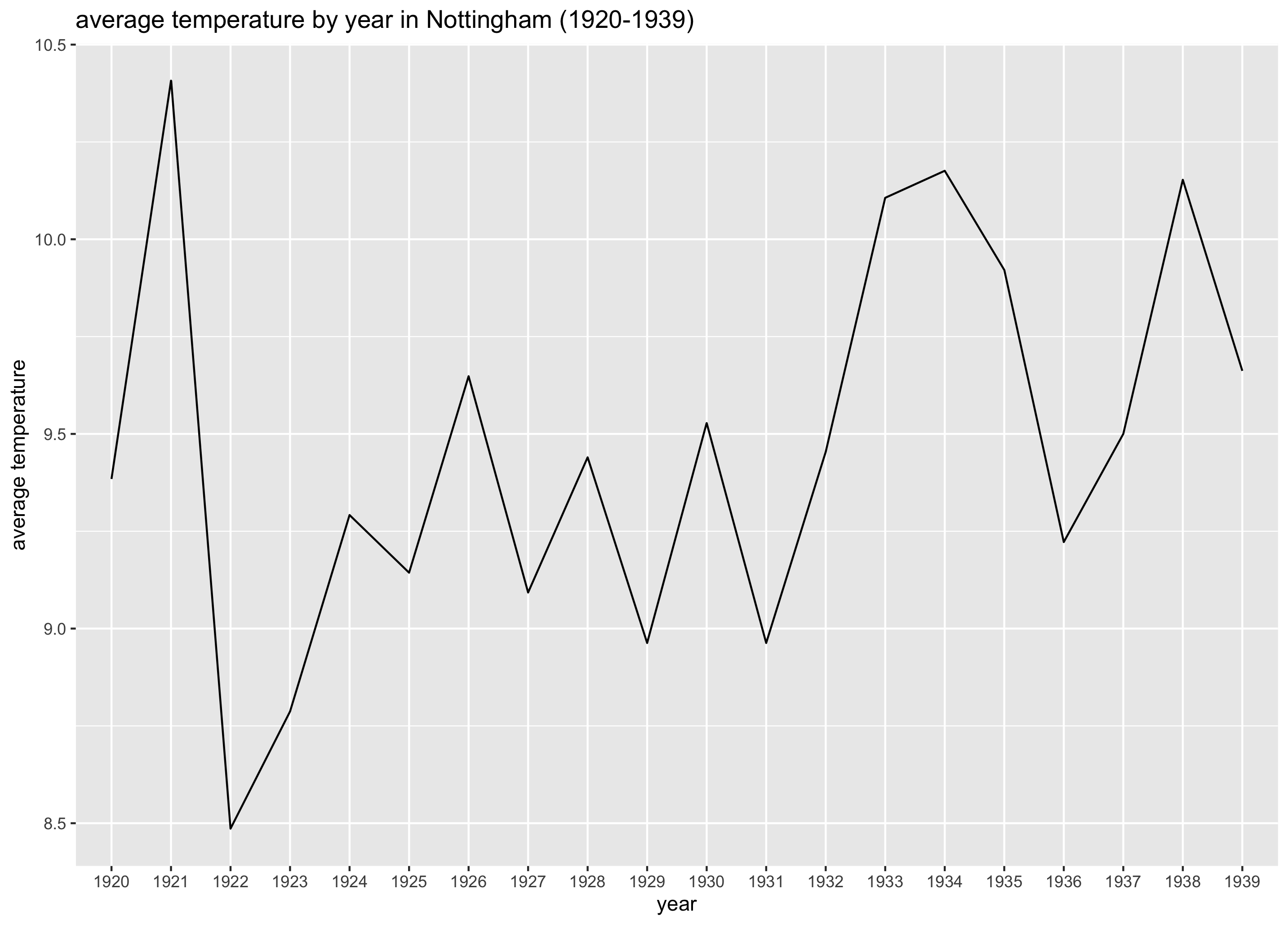
Insert quote US president about global warming…
Modeling
Thanks to the visualisation we have a pretty good idea of how the average temperature evolved over time. Intuitively you can see the average temperature doesn’t seem to change too much (at least it seemed not to in Nottingham from 1920 till 1939). But how can we summarise this in a simple way? Such a way is to use a model. If we calculate the autocorrelation (measures if observations are independent or not) we can extract the most important piece of our graphs (is there a trend or not?) and summarise it in a single number.
calculateAutoCorrelation <- function(avg_temperatures) {
  acf(avg_temperatures$avgTemperature, lag.max = 1, plot = FALSE)$acf[2]
}
lag.max means we want to compare with the observation (in this case year) just before. acf() returns way more than just the raw number but we only need the coefficient.
Reporting
The reporting part is skipped for now. If I want to create a somewhat half decent report I need more space than available in this post. It’s not too bad since the basic building blocks are set up. In a way the reporting is just a layer tying those building blocks together.
Summary
In just 54 lines of codes our example is ready to be put to the test. In the next post we’ll create some basic tests for our functions.