Visualize average goals per game in Processing
In a previous analysis I made a graph showing the average number of home and away goals by season. For some time I’ve been playing around with Processing but only ever focused on small examples instead of a real project. Reproducing the original ggplot2 graph mentioned above seems like a good start. Nothing massive, still feasible.
Parts of the graph
What exactly did the original plot look like?
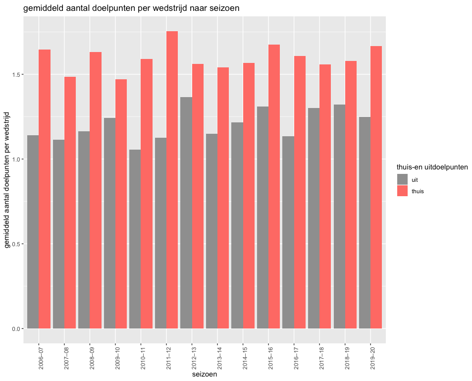
We can discern these elements:
- there are bars for both home and away goals
- season labels are on the x axis
- the y axis marks the average number of scored goals
- the graph has a title
- there’s a legend showing what color is home and what color is away
In this post I don’t plan on remaking the whole graph. I keep it limited to the bars and x/y labels.
I also won’t implement the graph all at once. We work from the inside out starting with the bars and then moving on to the x and y axis.
Getting the data into Processing
Average goals by season dataset
Before drawing anything we need to decide how to get the data into Processing. The data chapter of the Learning Processing book has a good explanation how to go about this. The most basic data format in Processing is just a String. This naturally leads to us using data in csv format.
The dataset for the average goals by season already existed since it was part of a previous analysis. but still had to be written to file. While at it I made some slight modifications since the variable goals_home_or_away is a bit too long and reminded me a bit too much of a particular tv series. So now the dataset contains these variables:
- season
- venue
- goals
Venue refers to if a game is played at home or away.
Loading the data
Loading the data consists of 2 steps:
- putting the data in the
/datafolder of the sketch - reading the data
Reading the data can be done in 2 ways:
- we can either treat it as just plain text and use the
loadStrings()function - or we can leverage it’s a csv by using the more specific
loadTable()function
If the data is loaded as text, you get an array of which each element is a row. The first element are the headers and the rest are data values. However, working with the data using the Table class makes things way simpler. This class has convenient methods like getStringColumn() so you don’t have to loop over all the rows each time you want to select a column.
The bars
Now on to the drawing. I’m not the first one to implement a bar chart in Processing although I was a bit surprised not to find a good tutorial for making one, even after some extensive googling. This sketch ended up being the most useful. It has some comments showing what issues might come up while drawing bar charts.
First attempt
A first implementation just loops over the average number of home goals by season and plots them as bars:
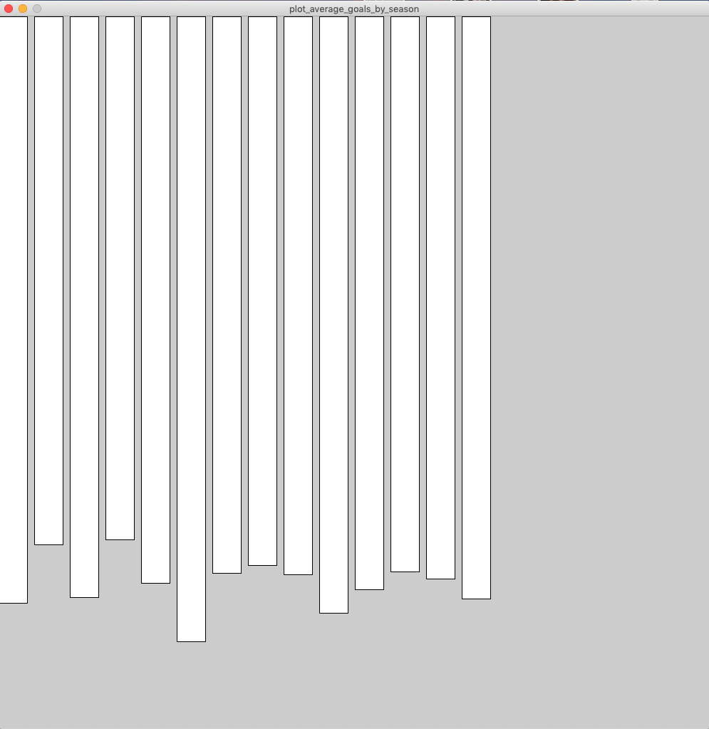
In a sense mission accomplished since these are clearly bars but somewhat underwhelming in other departments:
- the bars are dripping from the top while they should be aligned at the bottom
- there’s a lot of whitespace at the right side of the graph
- the bars are not colored
First thing to tackle is the rotation of the bars.
Turn the bars upside down
By default the Processing coordinate system has the (0,0) point in the top left corner. This doesn’t play well with drawing bars from the bottom up. In order to make it easier for us, it’s recommended to change the rectMode to CORNERS. In rectMode the first 2 arguments are the x and y position of one corner and the next 2 arguments are the x and y position of the opposite corner.This is what drawHomeGoals looks like now:
void drawHomeGoals(float[] home_goals) {
  // define as 2 corners instead of corner + width/height
  rectMode(CORNERS);

  // calculate variables needed for calculation corners
  float bar_width = width / (home_goals.length * 3);
  float max_home_goals = max(home_goals);
  float zone_width = 3 * bar_width;
  float y_margin = 0.1;

  // plot bars
  for (int i = 0; i < home_goals.length; i++) {
    float x_corner_one = i * zone_width;
    float y_corner_one = height * (1 - y_margin);
    float x_corner_two = i * zone_width + bar_width;
    float y_corner_two = height - home_goals[i] * (height / ceil(max_home_goals));

    rect(x_corner_one,
         y_corner_one,
         x_corner_two,
         y_corner_two);
  }
}
A small sketch makes the function easier to understand. In general sketching on paper is a good idea to get an idea of where you want to end up.
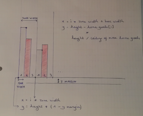
We define a zone as a combination of 3 elements:
- bar for home goals
- bar for away goals
- empty space between bars
In comparison to the original ggplot graph the empty space inbetween bars is a bit larger. By default it’s configured equal to the width of 1 bar. Also these bars don’t start at the edges of the window, but a small margin is provided. Later on the labels and ticks for the x axes will be placed here.
The calculation of the y position of the opposite corner of a bar is the most convoluted part. You have to scale the number of goals somehow. The maximum number of average home goals is a bit less than 2. Mapped directly to the canvas this would mean 2 pixels. This is negligible in a normal window size of for example 500 pixels. That’s why we multiply by height / ceil(max_home_goals). Taking the ceiling of the maximum home goals guarantees the bars won’t exceed the height of the window.
Note the size() function has the side effect of automatically creating width and height variables. Since a sketch is only valid if the size of the window is defined, we can assume width and height always to be defined. There’s no need to specify them as arguments to the drawHomeGoals.
Now the graph looks like this:
The bars are now neatly arranged at the bottom of the screen, but:
- they’re not colored
- the away goals bars are still missing.
Color the bars
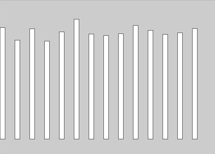
To see what color the bars had originally, there’s a handy Chrome extension called ColorZilla. We also have to make sure the bars have no borders. By default rectangles in Processing have both a fill (the inside) and a stroke. By calling noStroke() we make sure the borders are removed.
Away goal bars
The difference between away and goal home bars is twofold:
- they have a different position (one next to the other)
- they have a different color
We use the helper function setColor to help with making drawHomeGoals more generally applicable. The first idea was to define this helper function nested within the overarching draw function. Curiously enough I discovered this is not possible and not the way to handle that situation in Java. I opted to just make these helper functions globally defined. Not the best way but can always refactor later on.
This is the current status:
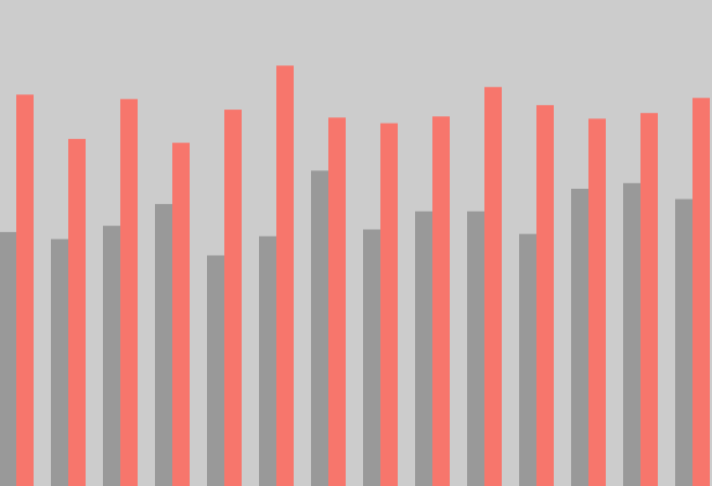
The bars closely resemble those created in ggplot2!
Refactor to object-oriented approach
Why object-oriented?
The code for the graph at this moment works just fine but sadly doesn’t scale too well. We need a different, modular approach to keep it maintainable. This is called object oriented programming.
Object-oriented programming is the marriage of all of the programming fundamentals: data and functionality.
The main advantage of object-oriented programming for me in this case was threefold:
- it forced me to think about what elements there are in the graph
- also forces you to think how these elements relate to eachother
- the code is modular so changes can be made in a single place
There are many more advantages to object-oriented programming, but the above were the most clear for me in this example.
Normally you would write your code in an object oriented way from the start. I expected this sketch to be smaller than it turned out to be so didn’t see no reason to overcomplicate things from the start. Turned out I ended overcomplicating by trying not to overcomplicate. However there’s a silver lining. As mentioned in the Processing tutorial, it’s a good exercice to rewrite code from not object-oriented to object-oriented.
Migration in practice
The migration itself is done in two phases:
- first we extract the functions
- afterwards the code is divided in classes
What the code actually accomplishes doesn’t change by migrating. The only thing changing is the organization and the way to think about the code.
In the end I reckon the biggest added benefit here was the use of inheritance. Take for example the bars. The bars displaying the home goals and away goals are similar because:
- they both have no border
- they both are drawn in
CORNERSmode - the rules of how their y values are determined are the same
But they’re also different:
- the fill color changes based on the venue
- the position within a zone changes based on the venue
By defining a GoalsBar class which is extended by the HomeGoalsBar and AwayGoalsBar classes we get the benefit of:
- only having to define the common fields and methods once
- having the elements specifc to each type of bar in a single place
I chose to define these classes:
- GoalsBar
- HomeGoalsBar (extending GoalsBar)
- AwayGoalsBar (extending GoalsBar)
- Goals
- XLabel
- YLabels
- Zone
So most classes map directly to visible elements on the graph except for the Goals class used to handle the data part. The Zone class is the missing link between the Goals class and the bar classes. The number of seasons to display (so the data) determines the zone width which in turn determines the bar width. There might be other options to classify the code but this one seemed the most straightforward.
Axes
Just to wrap it up I also decided to add the axes. The end result looks like this:
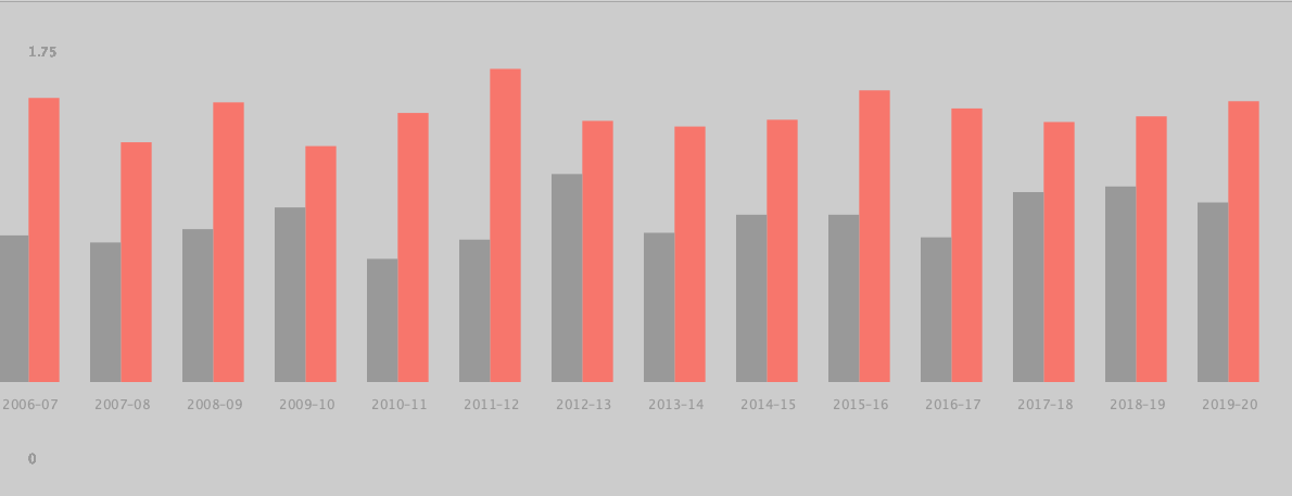
In the end it seems like quite a lot of time invested for neglible results. But at the same time I learned more about the intricacies of object-oriented programming which was much needed.
Open questions and notes
Some questions arose for which I don’t have a definite answer yet.
Can functionality be part of the constructor?
Take the HomeGoalsBar class where the x values of both corners have to be set. I chose to do this in the constructor itself like this:
x_corner_one = _i * _zone_width + _bar_width;
x_corner_two = _i * _zone_width + 2 * _bar_width;
However, I also could have created separate setXCornerOne and setXCornerTwo methods.
Method using fields not defined in class
Bars have to be displayed for both the HomeGoalsBar and AwayGoalsBar classes so the super class GoalsBar would be a natural place to put this display method. However, to display a bar you need the coordinates of both the first and second corner. The y coordinates are available for the GoalsBar class but the x coordinates are specific to home and away.
So if we define the display method in the super class it used fields not available. As an alternative the display function is duplicated at the moment between the HomeGoalsBar and AwayGoalsBar classes.
Should I use getters and setters?
Should getter and setter methods be used to have access to the attributes of an object or can we access these attributes directly?
How can classes work together?
At the moment I use this pattern:
int zones_count = goals.getVenueGoalsCount();
zone = new Zone(zones_count);
So first I get the attribute of an instance to pass it as an argument for the construction of another object. This works, but I can’t help to think there must be a better way of having these classes work together.